School Management Platform
A public school site with three role-specific portals behind it. Parent, student and teacher each get a different view of the same record, and the homepage preview of each portal is drawn with the real dashboard components.
- Built for
- Ghazali Public School
- Portals
- Parent · Student · Teacher
- Charts
- Custom SVG, no library
- Routes
- Site + admissions + 3 dashboards
Overview
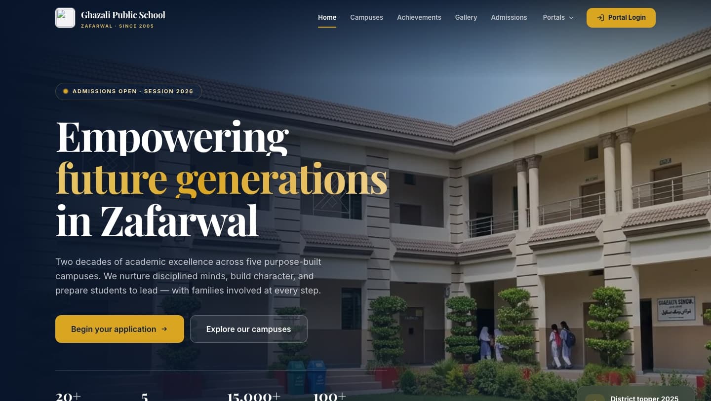
A school website joined to three portal experiences. Parents track attendance, results and fees across multiple children; students get a timetable, homework diary, live rank and an exportable report card; teachers mark a roster, enter marks subject by subject and bulk-sync a term. The marketing site and the product sit in one application.
Objective
Give three audiences with very different jobs a view of one academic record, without building three separate products.
Problem and opportunity
School software usually splits into a brochure site and an unrelated portal that feels like a different company built it. Keeping both in one design system means a parent moves from an admissions page to their child's attendance without a visible seam.
Solution
One data shape, three interfaces. The homepage portal showcase is deliberately built from the same chart components the dashboards use, so the preview cannot drift away from the product it is advertising — if a dashboard chart changes, the marketing preview changes with it.
Technology
- Framework
- Next.js 16React 19TypeScript
- Portals
- ParentStudentTeacher
- Data viz
- Custom SVG charts — trend, bar, ring, meter
- Services
- Firebase (Auth, Firestore, Storage) configured
- Styling
- Tailwind CSS 4Framer Motionlucide-react
Key features
What is actually in the build.
- 01
Parent portal
Multi-child switching, attendance trends, fee and voucher history and exam date sheets — every child on one screen, switched in a tap.
- 02
Student portal
Today's schedule, a digital homework diary, live class rank and a report card export.
- 03
Teacher portal
A smart attendance grid that marks a full roster quickly, an academic gradebook entered subject by subject, spreadsheet bulk sync for a whole term, and class analytics.
- 04
Previews built from the product
The three-tab portal showcase on the homepage renders live miniatures using the same chart components as the dashboards, not screenshots of them.
- 05
Public site
Hero, academic pillars, board results, campuses, gallery, testimonials and an admissions flow, plus a portal sign-in that routes by the selected role.
On a phone
Designed for the small screen too.
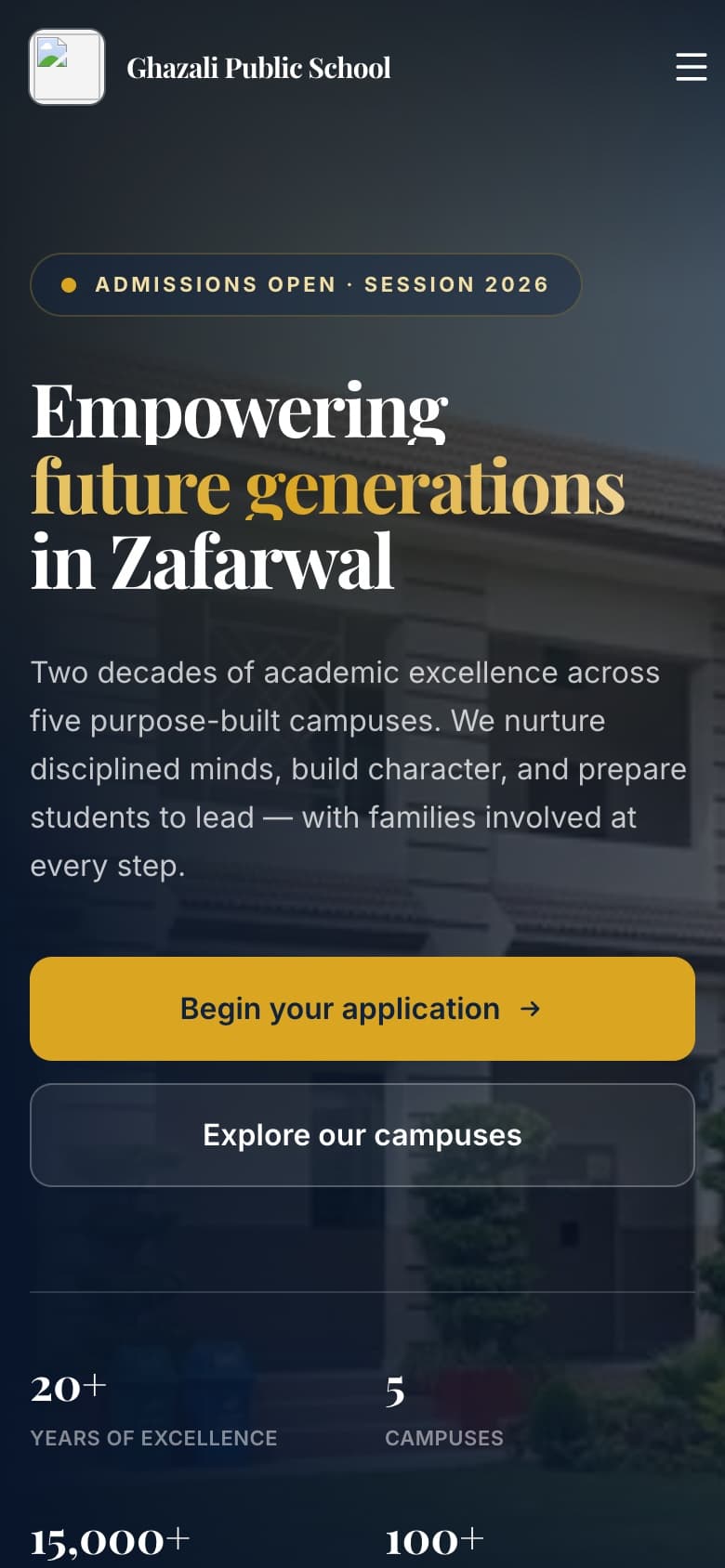
Captured from the live deployment at 390 × 844. The mobile layout is composed rather than scaled down — navigation, density and the primary action are all decided again for the narrow viewport.
UX and interface decisions
One system across marketing and product
The same tokens, buttons, fields and charts run through the public pages and the dashboards, so the transition from browsing to signing in has no visual break.
Charts drawn, not imported
Trend, horizontal bar, ring and meter components are hand-built in SVG. No charting library, and each one is styled to the same design language as everything else.
Tabs that carry real state
The portal switcher uses a shared layout indicator and an animated panel swap, with proper tab and tabpanel semantics underneath.
Technical approach
Role-shaped routes
Each portal is its own route with its own data module, so the three experiences can diverge in layout while staying in one codebase.
Firebase wired for auth and data
Auth, Firestore and Storage are initialised from environment variables. The prototype's sign-in validates input and routes by role; it is a demo sign-in, not an enforced authentication boundary.
Reduced-motion aware
Every animated transition — including the tab indicator — collapses to zero duration when the visitor asks for reduced motion.
Challenges
The parts that needed a second attempt.
Three audiences, one record
The same attendance figure means different things to a parent, a student and a teacher. Each portal frames it for the decision that role actually makes rather than showing the same table three times.
Keeping the preview honest
Marketing previews rot the moment the product moves. Building them from the real chart components was the cheapest way to make that impossible.
Next project
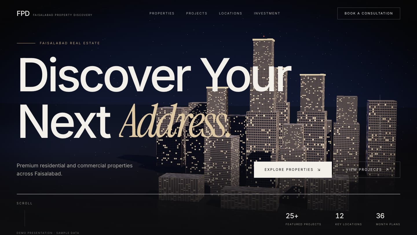
Property Discovery Platform
Faisalabad Property Discovery · Platform concept